Share
The design for the branding of Flint Vineyard and their wine labels was a collaboration between Chris Bedson Creative and Studio Hammond. Chris Bedson and Alex Hammond, old art college friends came together to work on this project.
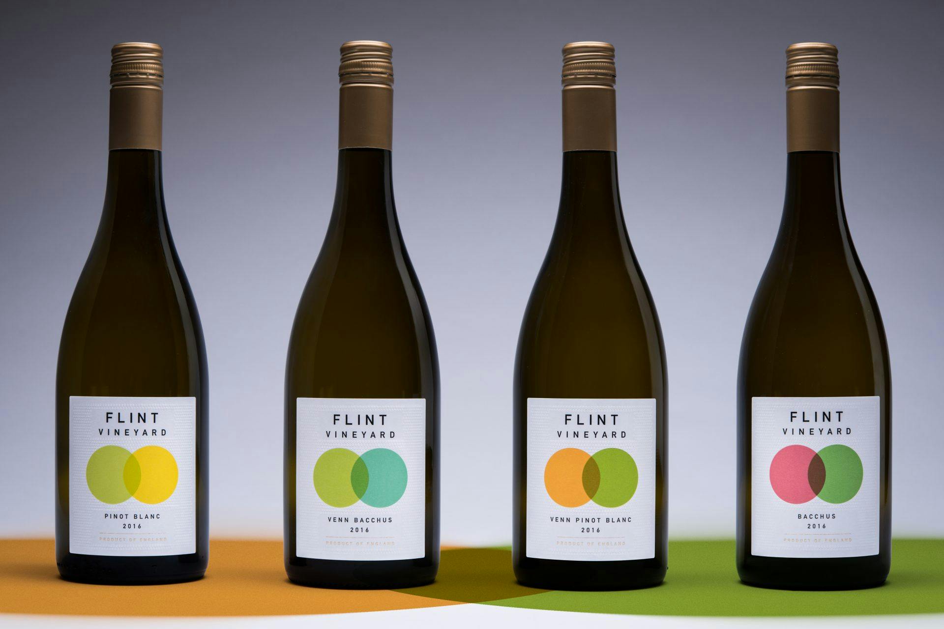
We were inspired by the scientific processes employed by Ben Whitchell and we felt it was this that really set what Flint were doing apart from much of the competition. We came up with the venn diagram graphic as a way of representing the scientific process of combining elements to create something new.
The colours used in the circles on the labels are representations of the flavour and aroma profiles of the specific wines. The combination of these flavours creates the unique profile of the wines. We used solid overprinting to create new colours where the circles intersect.
This circular motif was extended into a bespoke embossing across the front label.” – Chris Bedson Creative and Studio Hammond
Label information
-
Producer/Brand – Flint Vineyard
-
Designer – Chris Bedson Creative
-
Designer – Studio Hammond
-
Varietal – English Wine
-
Printing Press – Flexo
-
Embellishments – Tactile, Hot Foil, Custom Patterned Material, Blind Emboss, Rich Solid Flexo’s on uncoated material