Cases
Intricate design meets impeccable execution in the launch of Northwest brand
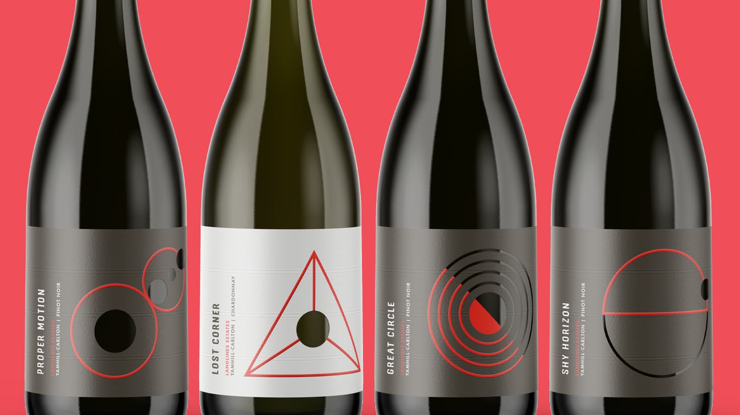
After discovering the perfect Willamette Valley site in 2016, Landlines Estates began producing iconic Oregon Pinot Noir and Chardonnay. Wanting their labels to be a tactile expression of their winemaking philosophy, they partnered with Doubleknot Creative to execute this vision.
Share
Going into the design process for Landlines Estates, local designer, Doubleknot Creative, wanted something truly unique. The design needed to speak to the premium price point of the wine and stand out from other Willamette Valley wines. MCC was asked to be part of the consultation call, in which we evaluated the preliminary design and made recommendations on how to print the labels to best achieve the desired results.
The approach to Landlines Estates wine is rooted in a belief that everything is connected, and by devoting attention to these connections, they can create more nuanced wines and truly express their unique vineyard sites. This feeling of interconnectedness extended to the label design, and even the names of the wines. Doubleknot included a large number of print elements, all of which had to be hit precisely in order for the whole label to work.
Throughout the design process, they worked closely with the MCC team to ensure the design was possible, and that it would maintain its integrity when printed. Interior cut-outs in labels can make application challenging, so the decision was taken to cut out parts of the label, while creating the look of an interior cut-out with a combination of ink, screen gloss varnish, and deboss. The background was created using a combination of finely detailed texture emboss and ink. A sculpted combination emboss/deboss elevated the critical design elements to create a standout effect.
We knew heading into the press check that this set of labels presented a challenge. From the background texture to the cutouts, everything needed perfect alignment in order to work. Thankfully, the press team have decades of experience and knew how to make adjustments for every small thing that we came across. I never doubted that they would be able to execute our vision. The resulting labels truly are a showstopper!
Katy Brown, Sales & Marketing Director, Ackley Beverage Group