Resources
Cases
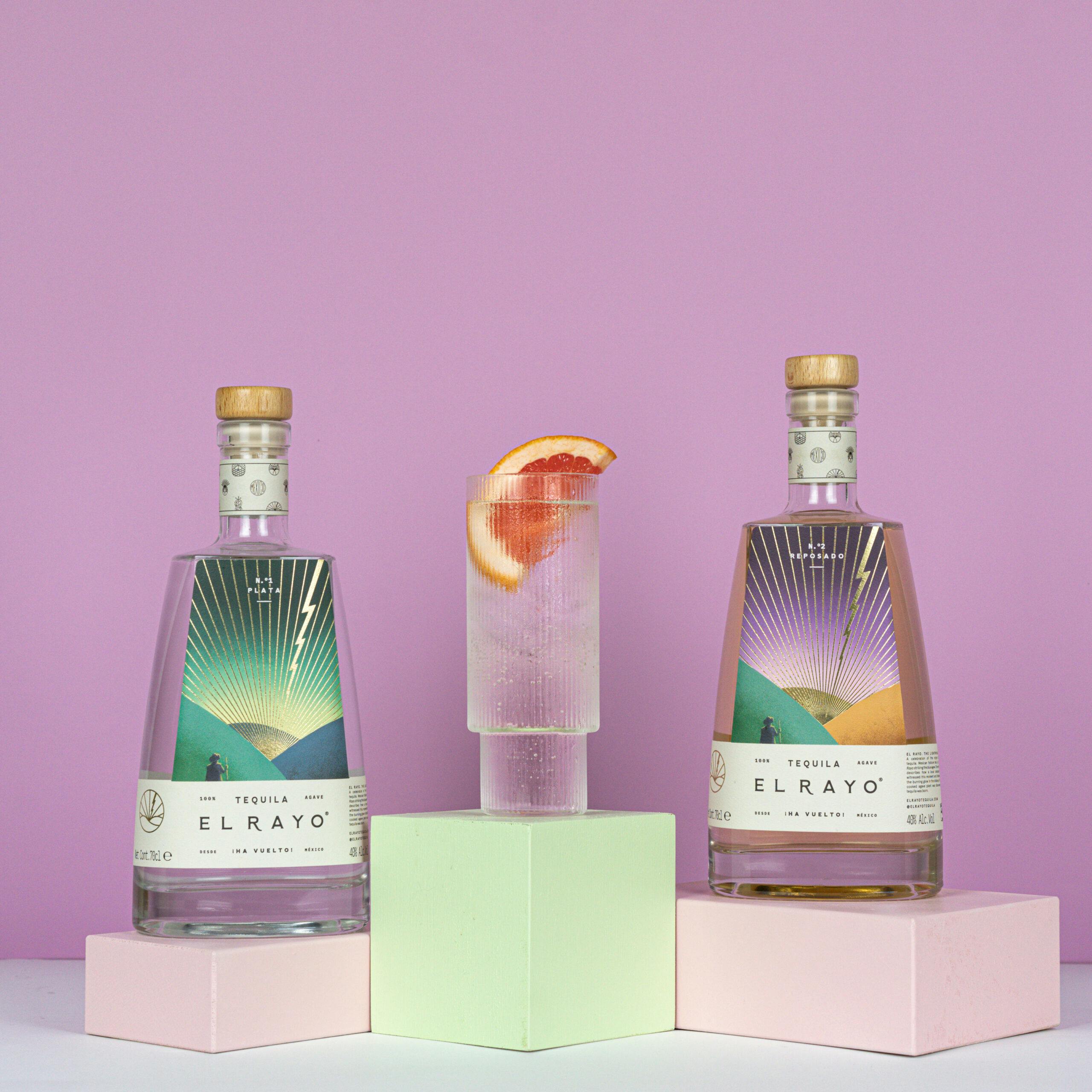
Lightning on a bottle: El Rayo’s label offers a fresh take on a legendary past
When the creators behind El Rayo Tequila set out to design their packaging, they started with a story, one that extends back generations. As the legend goes, a lightning bolt — or el rayo — struck a blue agave plant, and when a local farmer discovered the charred nectar flowing forth, tequila was born.
Share
This story was conceptualized and brought to life in a distinctive Art Deco and pop art inspired design by the studio Toro Pinto. The design represents the new, “modern Mexico” that El Rayo’s founders, Jack Vereker and Tom Bishop, fell in love with on their first visits to Guadalajara. MCC helped them translate that design into a premium label that reflects their mission to elevate tequila into a drink you sip, not slam. Textured paper and a matte varnish finish lend the bottle an artisanal feel while embossed lettering and foiled lines add a bit of flash that captures the contemporary spirit of the brand.
The challenge — color accuracy and foil spacing
El Rayo’s unique label design presented its own set of production challenges. MCC was up to the task, collaborating closely with EL Rayo’s team until everyone was satisfied.
In the beginning, a textured paper with yellow tones was chosen, but the tone of the material caused details of the image to be lost, in particular of the farmer. To correct this, MCC added white to the paper color and increased the yellow tones of the rest of the elements to mimic the appearance of the starting material without affecting the image. The striking foiled rays also took some trial and error to get right. The rays must pass under the name of the tequila flavor at the top of the label, which proved tricky given the thin font. To ensure that the rays didn’t obscure the letters, MCC split the foil into sections and created a hyper-thin border of foil around the design elements to achieve an organic look. Very small foil areas were also added within the letters where needed.
“The whole process was seamless,” said Jack. “We managed to get samples within about three days of ordering them, and MCC was really quick to make changes. The people you work with are very responsive and great at solving problems.”
The results — a bottle that speaks for itself
In the end, the payoff from this process has been big for EL Rayo. Jack and Tom say that their label is one of their biggest assets.
The quality of the label, from the foiling to the effects, is just insane. We’ve had unbelievable feedback from our customers — people keep their bottle well after they’ve finished their tequila and use it as a vase or water jug. We’ve also had some amazing retailers stock us in the UK, sold to lots of customers, and have been highlighted in many magazines and newspapers. The bottle is absolutely everything for us, and we love it.”
Jack Verecker, Co-Founder, El Rayo Tequila