Resources
Cases
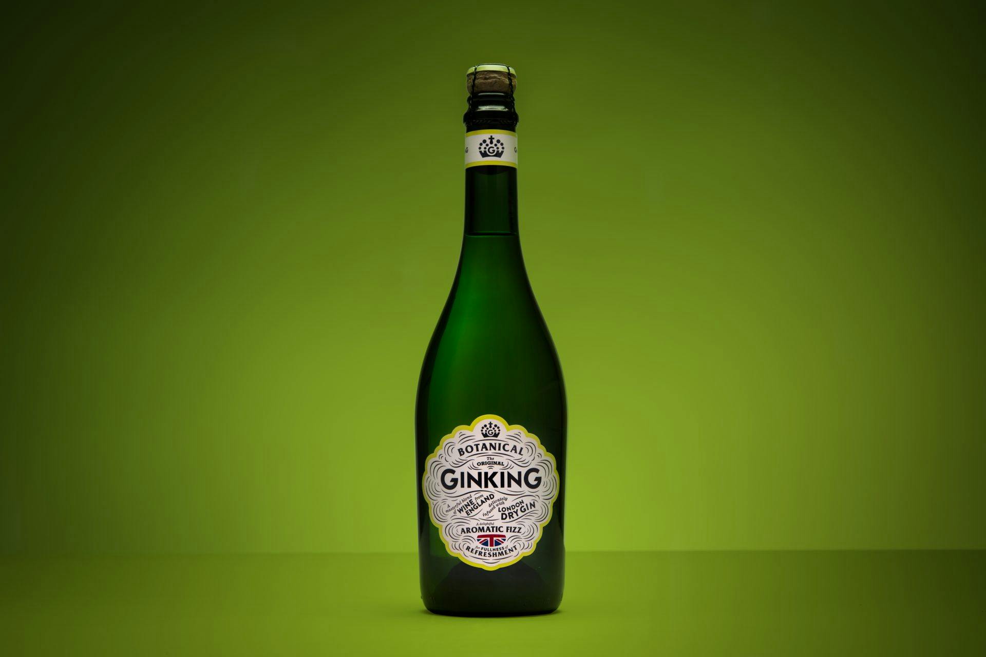
Litmus Wines GinKing Sparkling Wine
What do you do when launching an innovative new brand to market which straddles two very established sectors? How do you ensure you speak to consumers of both, rather than get ignored by all. You cherry pick the most potent of category cues from each sector and blend them effortlessly to create something entirely new.
Share
GinKing Sparkling Wine Label presented a unique design challenge in that it had to combine design cues from the two well-established drinks categories of Gin & Sparkling Wine.
It also had to feel unmistakeably English to reflect the premium home-grown fizz at it’s core. More specifically, the positioning needed to be that of a ‘modern English drink with it’s roots deep in tradition’ – a broad appeal to pique the interest of both savvy millennials as well as more seasoned wine and gin lovers.
The bottle shape instantly informs consumers that this is a sparkling wine, but the muselet is left open and sealed with a single branded band to speak the language of batch-produced craft gin.
The label shape, monochrome pallet, calligraphic ornaments, and ‘theatrical’ descriptors give the feel of a classic well-crafted heritage product. A crown motif and a Union Jack make the product feel unmistakeably English. The classic geometric logotype and crown motif also hark back to an ‘imperial’ past with its strong gin associations, cues further reinforced by a backdrop of vintage botanical engravings.
Lime green accents add a modern twist and nod towards the fresh taste appeal of the drink.
Label information
-
Producer/Brand – Litmus Wines Ginking
-
Designer – Liquid Studio
-
Varietal – Sparkling Wine infused London Dry Gin
-
Printing Press – Flexo
-
Embellishments – Tactile, Unique Die-Cut