Resources
Cases
Minerva beer is more Mexican
Cerveza Minerva has the title of the largest Mexican brewery in the country, a pioneer and leader in the category of craft beers for more than 16 years with a national presence and export abroad. Being a proudly Mexican company, their objective is to raise Mexico as a reference of the artisan movement, which is why they seek to reflect in all their products the Mexicanity essence of the brand.
Share
The essence of the brand and its line family
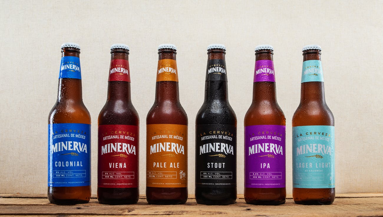
MCC dresses the Minerva line family, consisting of six beers: Colonial, Vienna, Pale Ale, Stout, IPA and Lager Light; each with a different style and the latest being the new launch with only 85 calories, occupying the place of the lowest calorie in the market.
‘La Minerva’ is the most representative roundabout of ‘La Perla Tapatía’ (Guadalajara), this is the goddess of wisdom, the arts and the patron saint of artisans, in line with what the brand represents. The image Minerva was born with has evolved over time; 4 years ago, they changed their image with the intention of highlighting its Mexican heritage, unfortunately the brand could not identify with it. It was decided to work on a redesign of the labels with the intention to reflect the Mexican identity while maintaining a current and contemporary image.
Lifting the label
In search of that lifting on their label, Minerva had very precise specifications to achieve it: they were looking for a very specific 60-gram paper that their labeling machine could support, they wanted a matte finish in metallic tones that they could not find with other suppliers, and they were looking for a supplier with presence in Mexico.
It coincided that MCC Guadalajara, Mexico appeared along the way to advise them with their project, although to meet all their specifications, it was necessary for the labels to be developed at the MCC Lucca, Italy plant. This was not a problem, as Minerva representatives traveled to the Italia plant to do the approvals at the machine and were delighted with the result. Also, because they have a good relationship with the Guadalajara plant, achieving that closeness and presence in Mexico that they were looking for from the beginning, making this a very successful inter-company project. “Although we work with a supplier that is on the other side of the world, this has never felt like this, we always have a very close attention, as if we were literally just around the corner”, comments Lidia Jauregui, Marketing Manager of Cerveza Minerva.
A plus they found when changing their label was that it has an “ecological” touch. This is because it uses a substrate that is easier to process, does not have a laminate and as it is a wet glue cut & stack solution, it can be removed relatively easily from the container, unlike self-adhesive labels.
The result
The launch of the new labels was done in a very subtle way, being very well received by customers. The company has received rave reviews from around the world about how much they like the new labels. In short, Minerva “hit the nail on the head” trying to make a much more contemporary identity, moving away from the stately.
The transition took us a year since we started talks with MCC, but it was very easy to carry out even though 2020 was a very difficult year. The authorization was made in January at the plant in Italy, the issue of Covid became very strong, with Italy being one of the European countries most affected by this pandemic. That certainly caused us a lot of fear, but we were surprised that there was never a problem with them in terms of delivery times or others. Launching the new image in these conditions was not a plan we had for the brand, but even so, we have had great results and a very good response from the people.”
Lidia Jauregui, Marketing Manager of Cerveza Minerva
“MCC exceeded our expectations, finding a lot of suitable solutions to our product, which were very important to us and which we had not been able to solve elsewhere.”