Cases
A renewed label for the Château Camus’ collection
After taking over the property in 2018, Joris Larriaut wanted to revamp the label of the château, which he found too classic and loaded. Our inhouse designers were consulted to re-label the Château Camus range, a Graves appellation, the jewel of the Larriaut Vineyards. The client wanted a chic, elegant and distinctive label.
Share
A label you want to touch
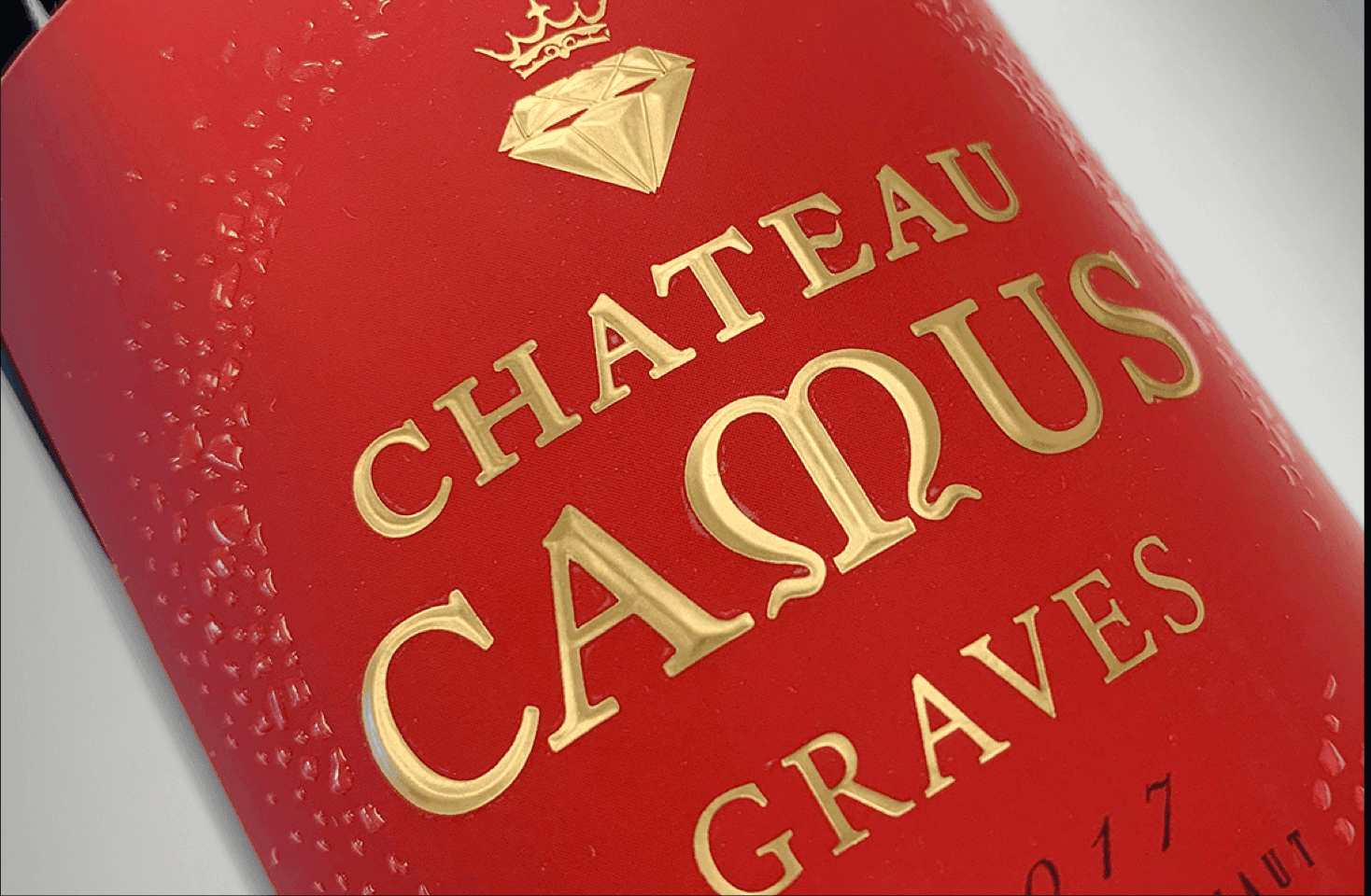
The customer had some main objectives he wanted to achieve: to highlight the original brand block, to energize the visual by a pertinent choice of colors, to work on the embellishments and to choose a differentiating paper rendering. Summarized all in one sentence, Joris wanted “a label that you want to touch”.
Therefore, we chose a Soft Touch lamination for a silky touch and feel. On top of that, we added value with the curved diamond-tip gilding and the relief screen printing varnish – all to enhance the brand. The legal mentions have been relegated to the back label to lighten the visuals.
We put the name of the Château in front with just a small diamond to symbolize the jewel of the Graves and then the signature. We wanted a very clean label, with a nice technical work and easily identifiable colors. The wager was taken! The label hit the export market in China and North America, and sales were also boosted in the hypermarkets where the range is referenced. You don’t just have to be good and well priced, you also have to be beautiful!”
Joris Larriaut, wine producer, Château MOUSSEYRON