Share
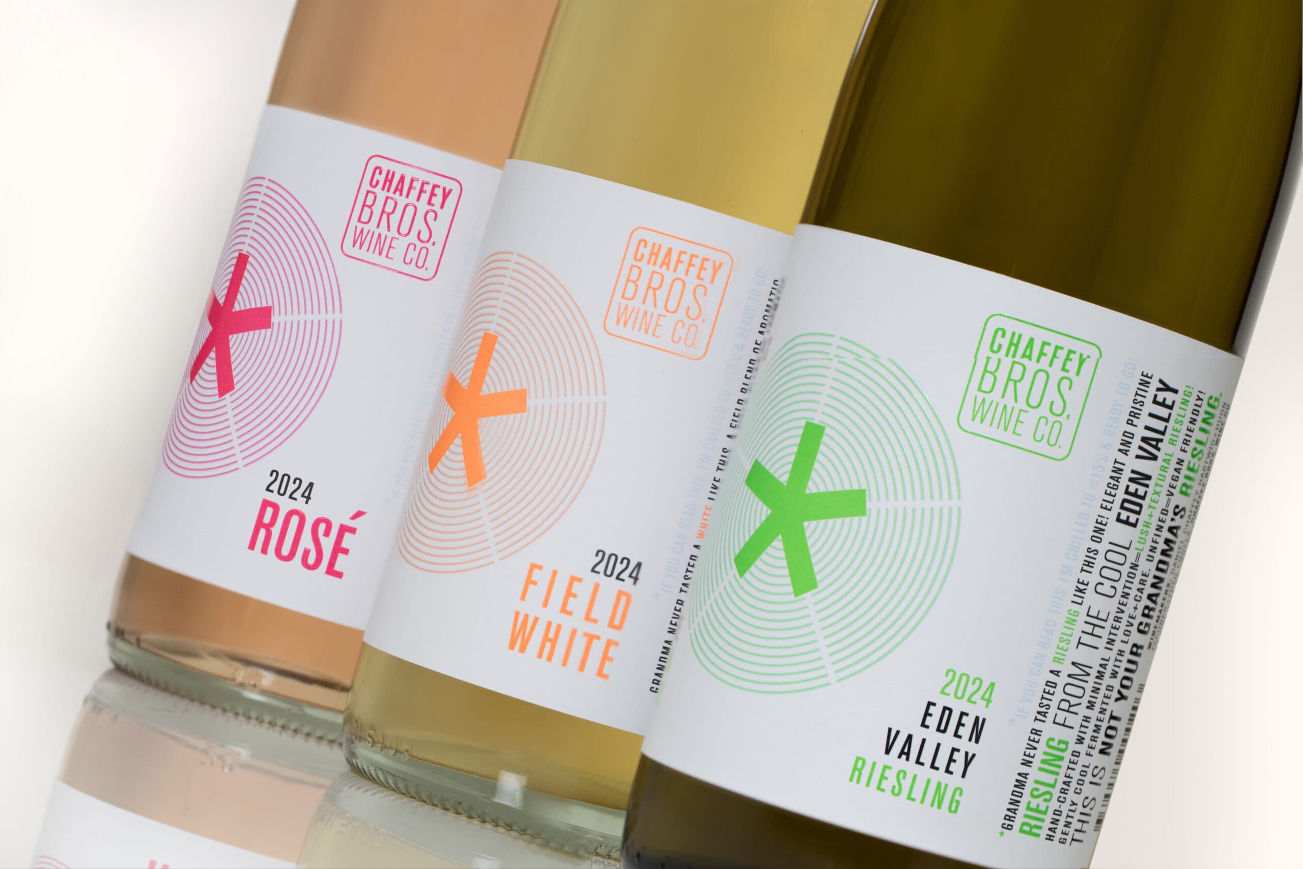
After a decade, Chaffey Bros. top-selling “NOT YOUR GRANDMA’S” range was due for a bold new look to better reflect the wine’s premium reputation and old-vine provenance. Chaffey Bros. redesigned the label with a more sophisticated, minimalist design, incorporating high-impact features such as neon inks and high-build gloss screen highlights. For the first time, thermochromic color-shift elements were added to create a dynamic visual experience that indicates when the wine has reached the optimal chilling temperature.
Printed on MCC’s Killer White paper, the labels resist moisture and retain their bright white finish in ice buckets, allowing neon colors to stand out in any condition.
“MCC were paramount in helping us navigate the challenges and understand the parameters of adding colour-changing elements over the top of another printed colour. The refresh signals a polished new era for the brand into the future.”
Label details:
- Producer – Chaffey Bros. Wine Co.
- Varietal – Riesling, Rose, White
- Region – South Australia
- Photographer – Mel Cordon
- Printing – Offset
- Substrate – Killer White
- Embellishments – Thermochromic and High Build Screen