Resources
Cases
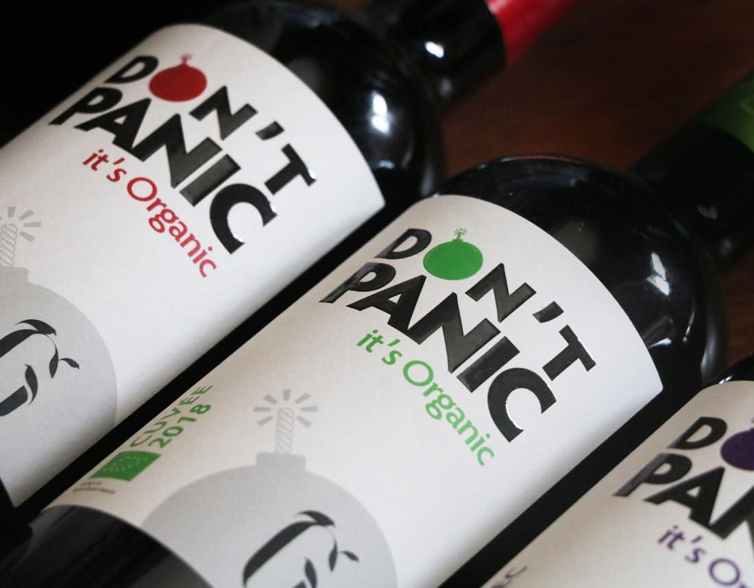
Don’t panic it’s organic
The graphic approach: to visually remove everything that codifies Bordeaux wines: the name and visual of the château, the vintage, the appellation… by using an identity that is deliberately Anglo-Saxon and somewhat out of place in the region of origin.
Share
Our idea is to unravel the myths about Bordeaux wine, which is neither overpriced, nor has-been, nor out-of-date, nor wines for daddy, but a wine for every moment and always good AND organic of course. Proud to be Bordeaux? yes, definitely!
Customer testimonial:
With a “crazy” visual idea, the support and the listening allowed us to obtain this result, very convincing visually speaking, taking into account the constraints of each one; even and especially in this very particular climate. Thanks to Maxime in particular and to all the people from MCC who intervened.”
Label information
- Name of the Product / Producer – Don’t Panic it’s Organic / Scea Le Bousquet
- Designer – Philippe – MCC Design
- Printing techniques
- Printing – Digital
- Paper – Tintoretto Gesso
- Embellishments – Relief varnish