Share
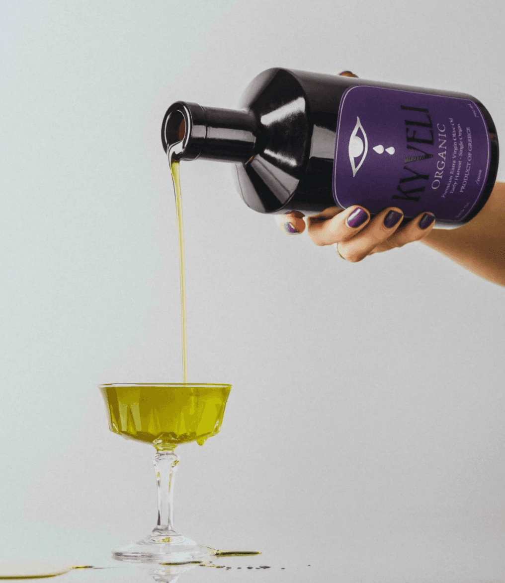
Kyveli’s first-year olive oil label was built on a simple idea enter the category, but don’t conform to it.
The design takes cues from architecture rather than traditional packaging. Its arched shape feels timeless, while the eye with falling teardrops draws from Greek mythology symbolizing olive oil as something rare, almost sacred. A deep violet colour adds a sense of quiet confidence, paired with minimal typography that keeps the overall look calm and considered.
The Label Approach
- Architectural arched form
- Myth-inspired symbolic detail
- Minimal, refined design
Foil and high-build finishes are used carefully, adding depth without overwhelming the label. Printed on Clarence textured paper with 30% recycled content and finished with a matte, water-resistant varnish, the material choices reflect both quality and responsibility.
The back label focuses less on selling and more on sharing, outlining the philosophy behind the product and the care taken in its production. Each bottle is individually numbered, connecting it to a specific harvest rather than a mass-produced run.
The result is subtle but confident. A label that stands its ground in a crowded space, not by being louder, but by choosing not to compete with the noise at all.
Label Details:
- Designer – Morgan & Harry Labrakis, Chris Soll
- Photographer – Bill Chen
- Printing – Digital
- Substrate – Clarence textured paper (30% recycled content)
- Finishing – Matte water-resistant varnish