Share
Located in the Swan Valley, Mandoon is one of Western Australia’s most well-known wineries. Mandoon approached design agency Manifesto to review their branding and labels as they were long overdue for an update. They wanted to move towards a natural, biodynamic feel that was reflective of their winemaking and their location.
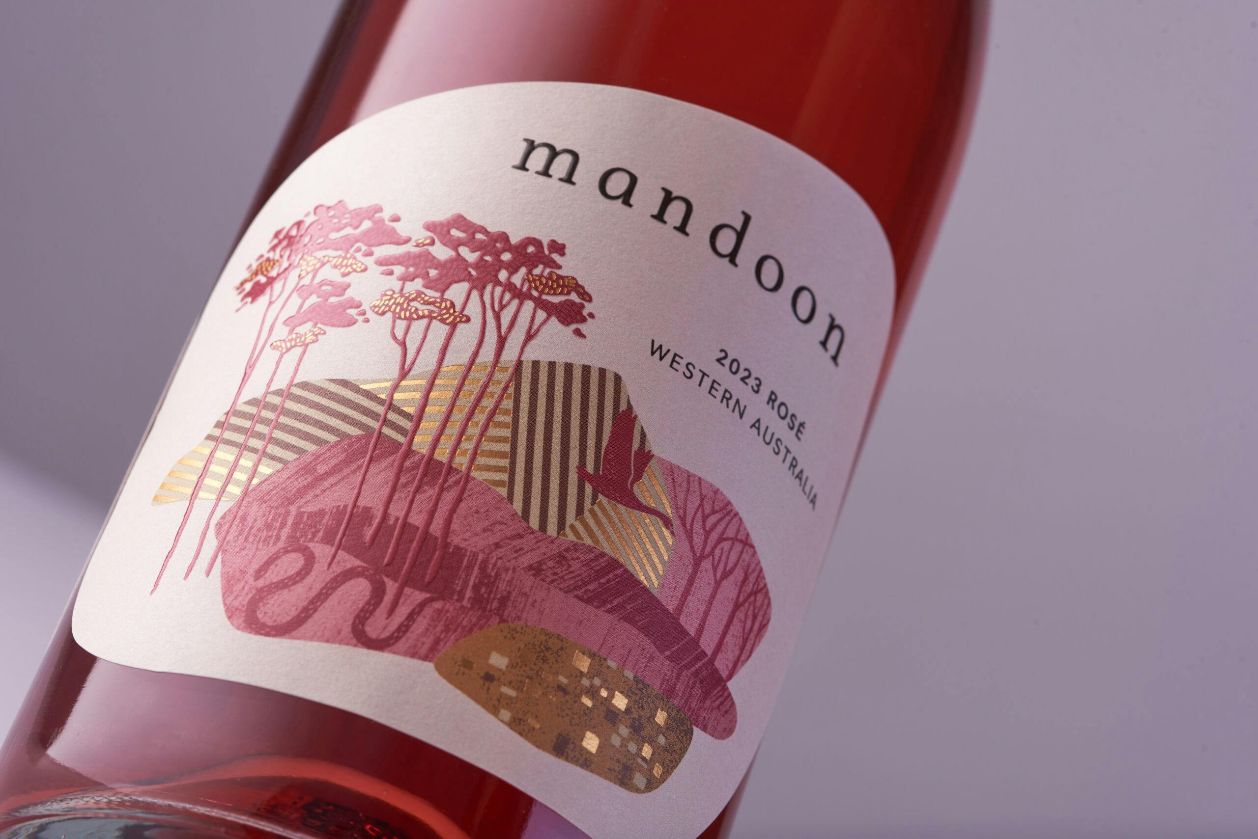
The word ‘Mandoon’ is derived from the Noongar language, meaning ‘place of many trees’ – and so trees are a key feature of the label illustrations. The labels are differentiated with a colour for each varietal, creating striking visual identities across the range. Patterns and textures within the illustration are highlighted with gold foil and the trees are given a tactile feel with a raised high build screen. The distinctive irregular shape of the front and back labels compliments the illustration and creates a more natural and organic feel for the Mandoon brand. This is reinforced by the choice of a white, uncoated material, which has a tactile “hand-made” appearance and feel.
The MCC Perth team have delivered a unique range of tactile labels with superb attention to detail.
Label details
- Producer – Mandoon Estate
- Region – Swan Valley, Western Australia
- Varietals – Verdelho, Vermentino, Rosé, Shiraz, Sauvignon Blanc
- Designer – Luisa Rheinlander, Manifesto
- Photographer – Ben Capelli
- Printing – Digital
- Substrate – Artisan
- Embellishments – Foil, High build screen


