Cases
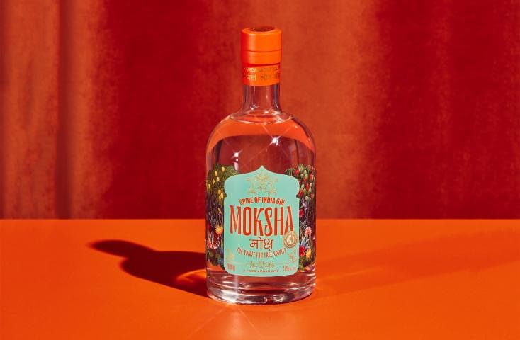
Textured Varnish Adds Depth to the Moksha Jungle
A tiger among gins, Moksha is the spirit for free spirits. Inspired by India but crafted in Aotearoa, the Moksha brand needed to embody the vibrancy and energy of India in a contemporary, fresh and bold way.
Share
The design brief for this product was to visually bring the Indian jungle to life on a label. This involved collaborating with illustrator Victoria Garcia to create an evocative jungle scene which organically wraps around the bottle. This features key characters such as a tiger, a sambar deer and tropical plants and botanicals.
The main shape of the label is inspired by an Indian doorway, and uses a combination of large typography, Hindi script and custom icons/illustrations to create a modern yet ornate design.
Label Information
-
Producer – NV & Co. Distilling Limited
-
Label – Moksha – Spice of India Gin
-
Designer – Charlotte Sowman from Libby & Ben
-
Photographer – Simeon Patience, The Collective Force. Styling by Sam van Kan.
-
Printing – Digital
-
Substrate – Silver Metallised, Glassine
-
Embellishments – Matt Texture Varnish, Matt High Build