
Share
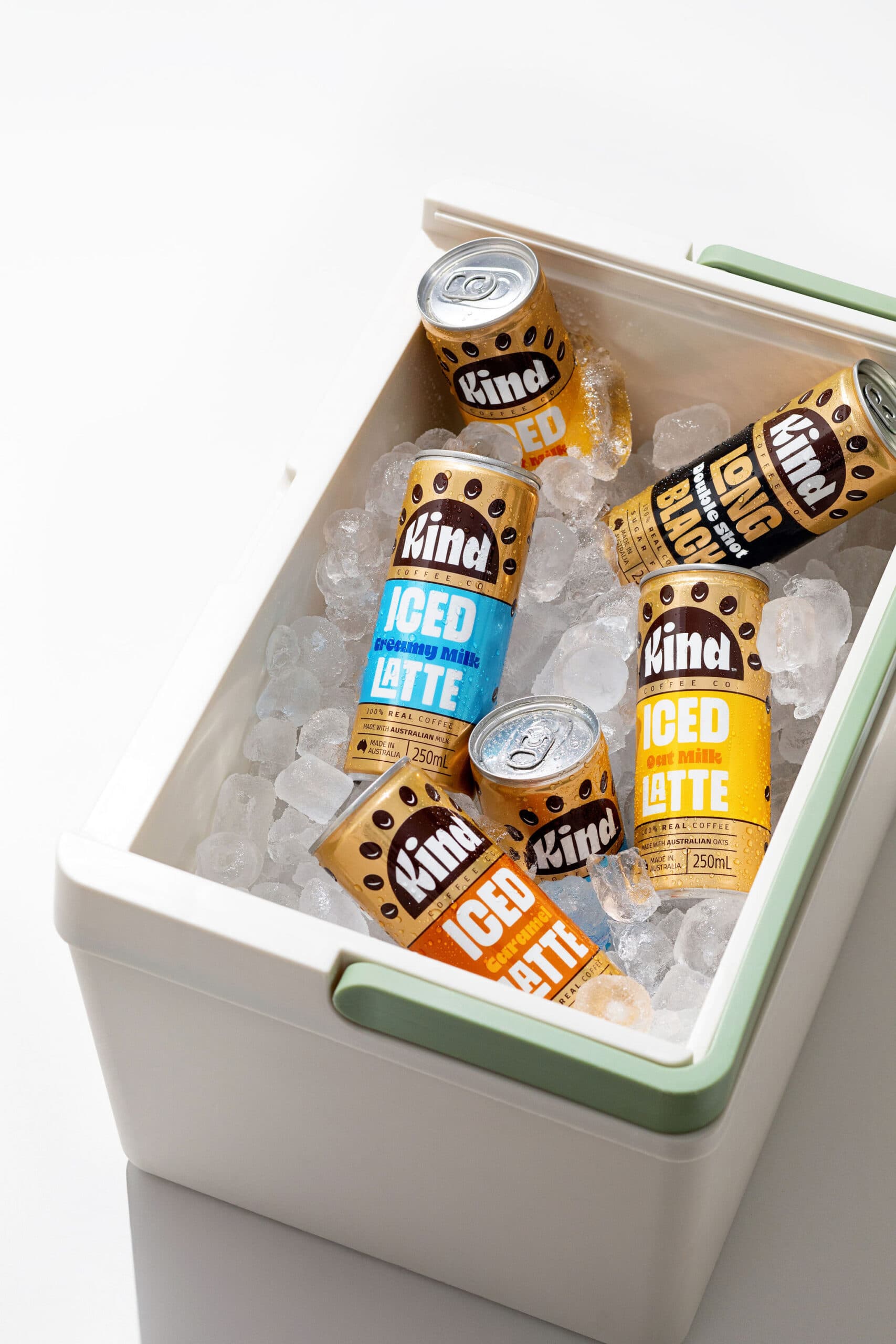
In a market crowded with flashy canned coffees, The Kind Coffee Co chose a different path. Quietly bold, intentionally thoughtful, and deeply human, their mission is simple: slow down, connect, and share small acts of kindness. Every can is more than a drink; it’s a moment, a message, a gentle reminder to embrace everyday moments.
Designer Jo Schultz brought this ethos to life. The challenge? Turning a silver can into a warm, inviting metallic canvas without overwhelming the brand’s calm, approachable tone.
The Label Solution
- Substrate: rPET Shrink Film
- Printing: Flexo, with digital prototypes to test metallic intensity
- Effect: Silver can shines through, creating a warm bronze metallic glow
- Highlights: Satin finish on the product name for subtle elegance
MCC’s digital pre-production process gave the client multiple metallic options to choose from, ensuring the final label perfectly captured the designer’s vision. The result is a label that’s premium, modern, and expressive, a reflection of the brand’s philosophy.
From Iced Latte Caramel to Long Black, every can carries cohesion, clarity, and a sense of calm in a noisy market. One can. One message. One act of kindness at a time.
Label Details
- Producer – Kind Coffee Co
- Region – Queensland
- Designer – Jo Schultz (Jo & Co)
- Photographer – Josh Raymond
- Print Technology – Flexo
- Substrate – rPET Shrink Film
- Embellishments – Metallic effect via controlled white ink