Resources
Cases
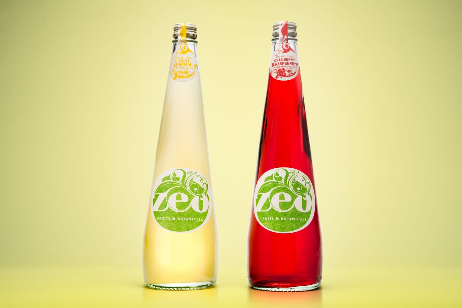
Zeo Fruit and Botanicals
Zeo is far from your conventional soft drink. So, falling into line with the rules of the category was not an option.
Share
Having undertaken a radical reformulation of its four flavours, Zeo could rightly champion extraordinary taste alongside its low-calorie, no added sugar and natural ingredients claims. For a soft-drink based on a unique blend of fruits and botanicals, the design needed to make a statement of intent as bold and ambitious as the product itself. Working with renowned illustrator, Si Scott, a solution emerged that does just that. A combination of imaginatively elegant illustration, distinctive colours and tactile materials takes consumers on a sensory journey as carefully crafted as Zeo. Multi-Color Daventry was delighted to be working on the re-branded design with 1HQ, we began discussing the concept which carefully balances and brings to life Zeo’s unique botanical blend. In understanding the goals of 1HQ we worked on creating custom colours to bring the design to life. To reflect the craft elements of the design we finished off the labels with a heavy matt varnish providing a hand-crafted natural feel.
Label information
-
Producer/Brand – Zeo
-
Designer – 1HQ
-
Varietal – Soft Drink
-
Printing Press – Flexo
-
Embellishments – Multiple Layered Flexos and Textured Matt Varnish