Cases
Boutique distillery captures all occasions with label range
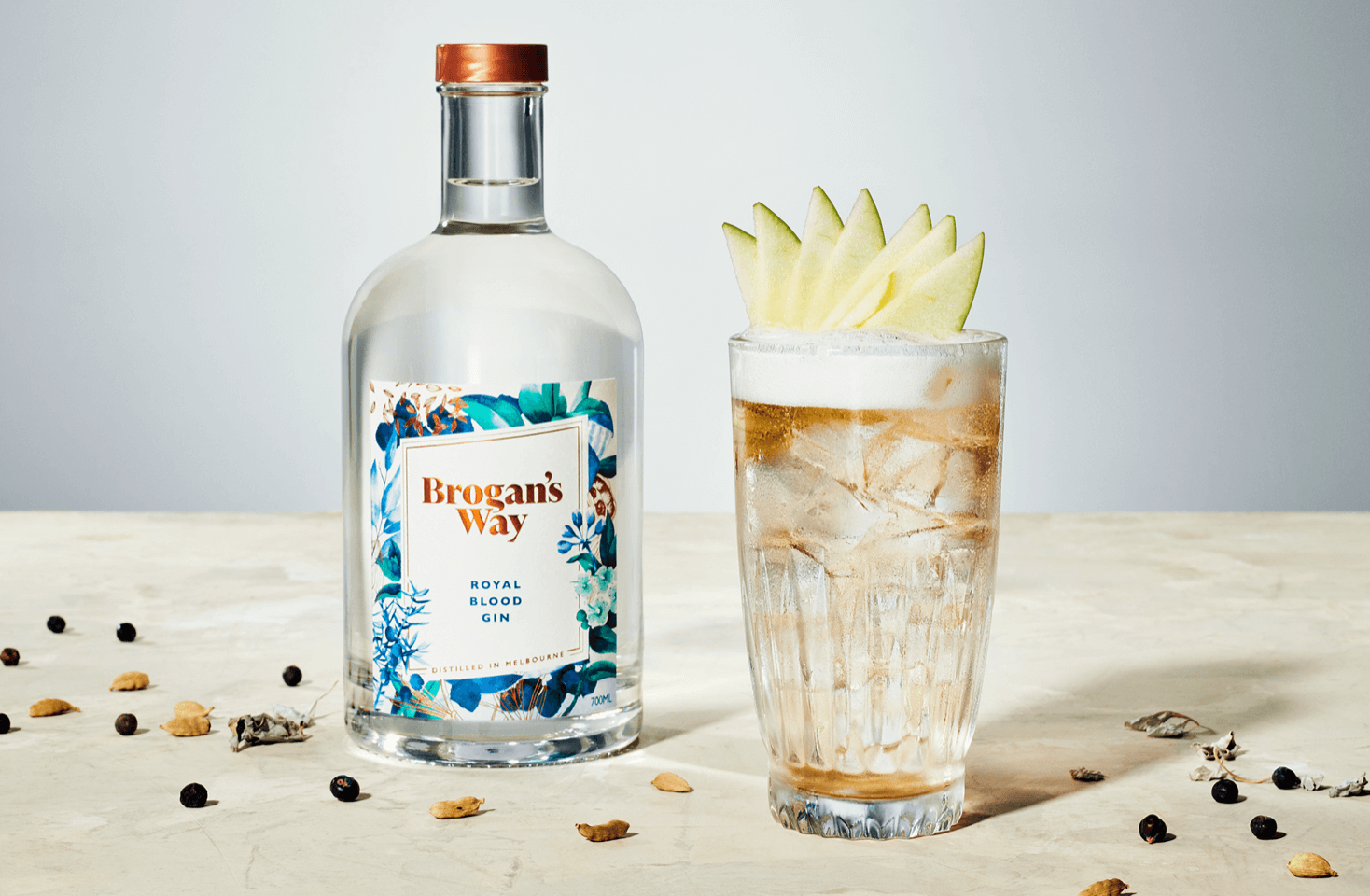
Brogan’s Way is a boutique gin distillery and bar located in Richmond in Melbourne. Using a mix of art, science and intuition, founder Brogan Carr strives to make complex and balanced gins.
Share
Design agency, Sense Advertising, had the challenge to create a single design that could be used across all varieties, using only color as the main distinguishing factor. The labels needed to be harmonious when placed alongside one another, but also be impactful on their own.
The entire range of labels capture the curiosities inside a botanist’s journal from times past, using painterly illustrations intricately layered with embellishments of bronze foil to create an overall refined and sophisticated look. An aesthetic carried across each label. Meanwhile, the vibrant and distinctive colors chosen for each of the varieties evoke the moment that flavor is tailored to.
This past year, Brogan’s Way decided to produce a limited-edition release of just 1000 bottles, especially for Mother’s Day. They wanted to ensure the branding stayed consistent with their staple offerings and could also maintain suitable pricing. The MCC team jumped into action, working with the designer to ensure the design as consistent with past designs. They also utilized the existing emboss and foiling plates for the brand and the botanicals around the edge. This saved cost and ultimately the only change needed was the varietal, which was done via printed text.
Mother’s Day last year just felt a bit flat with everything that was happening at the time. So, this year, I really wanted to celebrate the moment and once again drew upon the inspiration of my mother to do something a bit extra and created a new pink gin in celebration. As always, MCC made it happen, ensuring branding was consistent and the process was as smooth as possible.”
Brogan Carr, Head Distiller, Brogan’s Way