Cases
Clarence Distillery embarks on a new gineration with debut range
When Adam Freeman and Alison Sloley packed up their life in Adelaide in search of a new adventure, they hadn’t even heard of Yamba in the Clarence Valley, northern New South Wales. Fast forward one year and the duo have discovered a new love for distilling, and in September 2020 launched the aptly named Clarence Distillery. Their first spirit, Duke Gin, pays homage to the region’s namesake the Duke of Clarence (1765-1837) who went on to become King William IV.

Share
Challenge
Adam and Alison were seeking a natural looking material for their labels to align with the natural aesthetics of the Clarence Distillery brand. The Natural Kraft paper in our ever-growing environmental material portfolio was an ideal choice. Read on to learn how we worked together to create their beautiful labels.
Solution
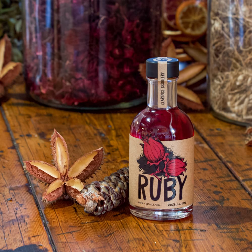
Clarence Distillery engaged Yamba local Adam Woodleigh, founder of Redalfalfa Graphic Design, to create the artwork for the brand’s newly crafted range. First to debut was the Duke Gin, followed by the Ruby Gin and Emu Vodka.
Manuel Rooney, based at Multi-Color (Brisbane) and a regular traveller to the Northern NSW region, worked closely with Adam to bring his designs to life on the Natural Kraft. This paper is made from 80 per cent recycled content and 20 per cent post-consumer waste. The brown, earthy uncoated stock provides a rustic hand-made look, which matched the raw timber used to build the distillery.
Each label has a unique cut out design detail to accentuate the feature image. Our prepress department recommended using a high build to further enhance the Duke, rosella flower and emu illustrations. This premium embellishment uses a silk screen process to provide a tactile effect to key design areas that sits above the label surface. This glossy effect provides excellent contrast against the uncoated Natural Kraft material.
We added a white ink to enhance the opacity of certain design elements on the darker kraft material. The white ink was also applied under the mandatory health warning and the barcode to ensure ease of readability.
The labels were manufactured at Multi-Color (Sydney) using our digital printing capabilities. Our HP Indigo digital presses are designed with the environment in mind with each subsequent press model using less energy and supplies per printed page than its predecessor. We print using HP Indigo Inks which are certified for both home and industrial compostability.
Result
The result is an eye-catching range of labels to signify the launch of a new gineration.
Clarence Distillery is donating $2 from the sale of each bottle of Emu Vodka towards the Lions Club of Clarence – Environmental’s campaign to raise awareness and preservation of the region’s coastal emu population.