Resources
Cases
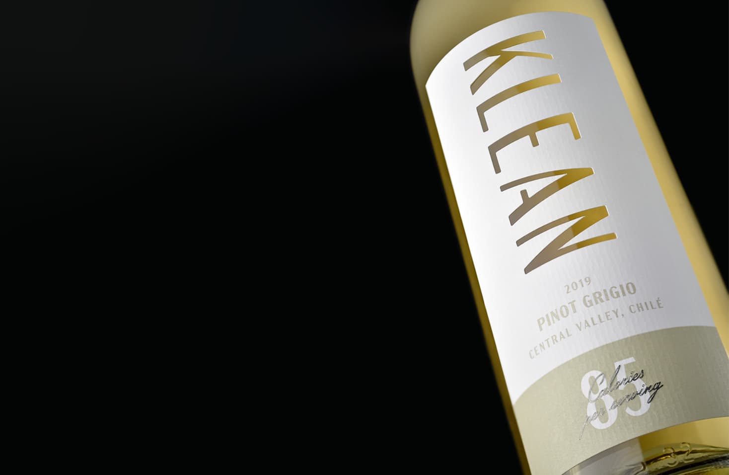
Creative use of cut outs captures brand concept
Based in Seattle, Precept Wine is one of the leading wine producers in the Northwest US. Family-owned with deep roots in the wine industry, Precept boasts a unique portfolio of cutting-edge brands. Having worked successfully with MCC for countless projects, they approached them with the concept for a new private label line of wines called KLEAN.
Share
The concept of KLEAN played off of the “healthy” trend happening in wine and spirits today, leveraging a double-entendre with the name of this 85-calorie per serving wine.
Precept’s design vision was a cut out of the brand name “Klean”. In consultation with MCC’s technical team, it was advised that the font in the initial design would result in a floating triangle from the upper case “A”, and could cause potential application issues. With this guidance, Precept instead selected a font with an “A” in one piece, resulting in executing the design as envisioned and successful application.
The critical component for this design was the interior die cut, also known as cut outs. The finished labels were printed on Killer White stock, ideal for refrigeration and ice bucket performance. The labels were finished with a grain texture emboss to replicate Estate 4, foil stamp, and emboss. This value-priced wine had a tight budget to convey the aesthetic, but with some creativity and innovation, the look was achieved.
“Interior die cutting can be challenging for both production and application- it’s critical to review the cut out for size, placement and shape before production to ensure success. Thankfully, our innovations team here at MCC has the experience and technical know-how to ensure the best outcome, while still maintaining the integrity of the design as envisioned. The collaborative approach always yields outstanding results!”
Lori Stewart, Sales Director, MCC North America Wine & Spirits