Cases
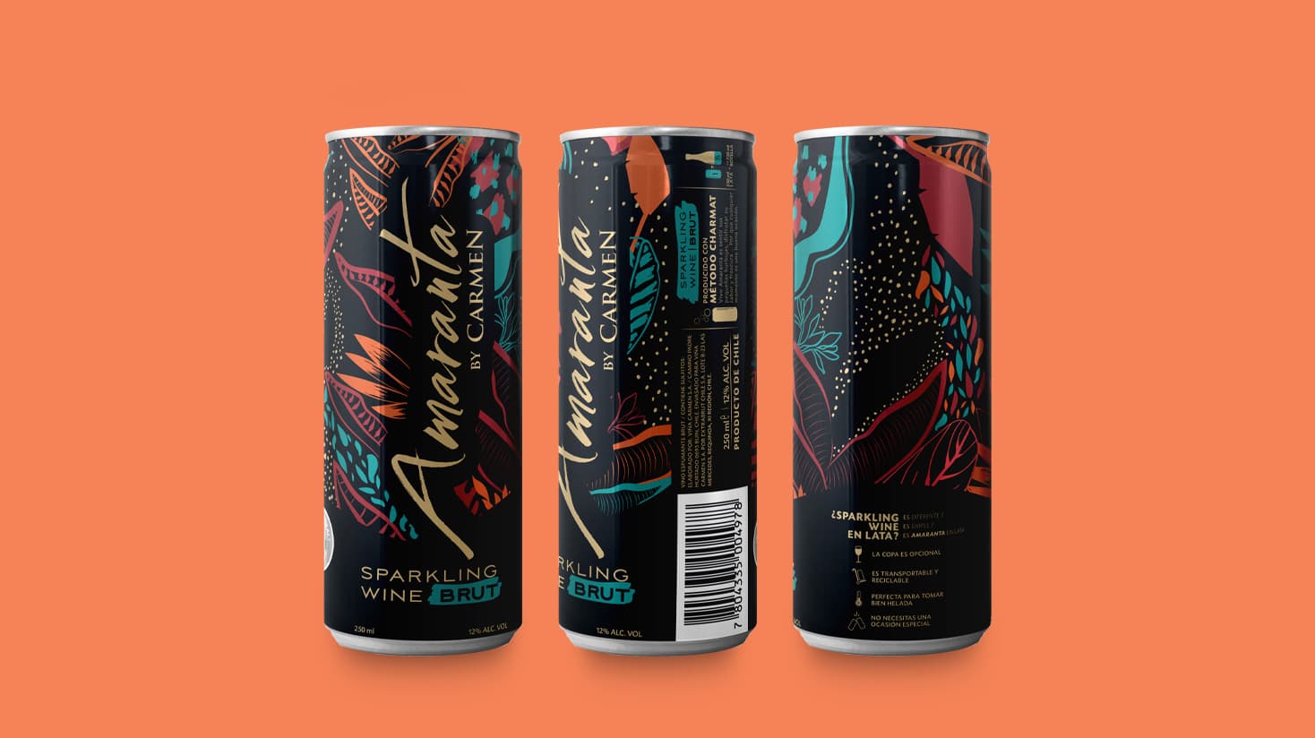
Elegance in a can
Without a doubt, Amaranta Brut has been one of the biggest challenges for Chilean winery, Santa Rita Vineyard. The challenge? Changing the format of a brand that was already firmly positioned in the marketplace, with a unique style and communication, from a bottle to a can. The spirit of the Amaranta brand is free, youthful and modern – something that the can format embodies perfectly.
Share
Santa Rita Vineyard had worked with MCC before and was confident it had a partner that could help it develop and execute this vision seamlessly. The collaboration resulted in a design with 360° graphics, allowing a continuous visual tour, taking advantage of every corner to communicate. Since the product was a sparkling wine, the use of a matte finish gave it just the touch of elegance that bubbles require. Finally, the team opted to use thermochromic ink, which offers the possibility of giving the consumer an optimal temperature tip to enjoy the product at its best.
I think that when creating labels, reciprocity between technical application and design is essential. To achieve such reciprocity, you need a partner capable of understanding all these complexities. MCC Chile helped us make the design feasible and we are very happy with the result. We believe that working in this way we will be able to achieve more and even better things in the future.
María Paz Galvez, Graphic Designer, Santa Rita Vineyard