Cases
Highly embellished abstract label, meets Post-Consumer-Waste material
The Designers Institute of New Zealand awarded Chemistry Gin a gold medal for its packaging at the ‘Best Awards’ in Auckland and the gin was also awarded Gold at the Women’s Wine and Spirit Awards 2023.
Share
Developed by Marie van Drimmelen, a medical biochemist, and stand-up comedian Laura Bruce, Chemistry Gin is a modern London Dry-style vegan gin. It’s also the first New Zealand gin bottled in one-hundred percent post-consumer glass. Chemistry Gin set out to explore the unexpected, a fresh take on craft spirits that blurs the line between pragmatic science and the pure joy of a well-mixed drink.
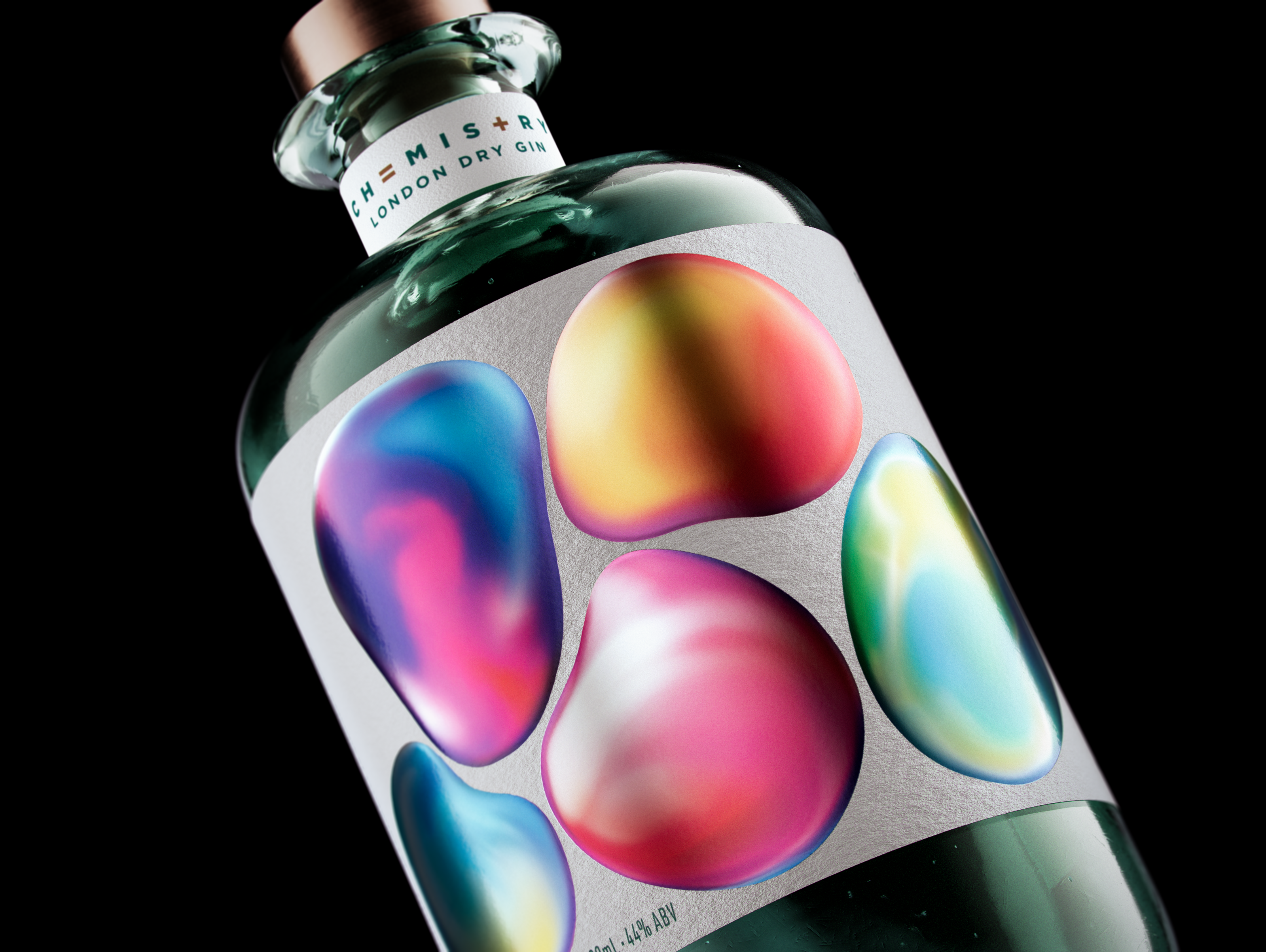
Finding unexpected links between science, nature, and experimentation were essential elements in the design process. Conscious of avoiding any obvious chemistry lab cliches, the designer, SingleDouble, worked to a theme of enhancing and elevating the creative, slightly wonderous side of science. They wanted to devise a highly engaging look with a dash of intrigue, linking chemistry to relationships between people and nature. Abstract orbs were created to portray this organic interconnectedness, the shapes and colors morphing and blending into each other like polished stones or floating bubbles. Overprinting on silver foil and adding a high build element to each orb lends a sense of subtle appeal and a tactile finish.
MCC New Zealand provided guidance along the way in terms of the various options available to achieve the desired look. Samples from global MCC sites were used to demonstrate the suitability of the solutions proposed. Sustainability was an important concern, so a 30% PCW material was used.
This design for Chemistry Gin represents what we love about good design, it looks effortless, but it took a team to create something so simple.– Trudy Hunt, SingleDouble
Everyone comments on our packaging – it really is eye-catching. The beautifully colorful label, coupled with our pale green bottle is a powerful combination that’s really registered with consumers. Our design team, SingleDouble, did a fantastic job developing branding which makes Chemistry leap off the shelf!– Laura Bruce, Co-founder Chemistry Gin
Label Information
-
Producer – Karori Drinks Co.
-
Designer – SingleDouble
-
Region – New Zealand
-
Printing – Digital
-
Paper – Bright White Felt 30% PCW Material
-
Embellishments – Silver Foil, overprinted CMYK, Highbuild on Orbs.