Cases
Innovative Use of Varnish Results in a Tactile Label Background
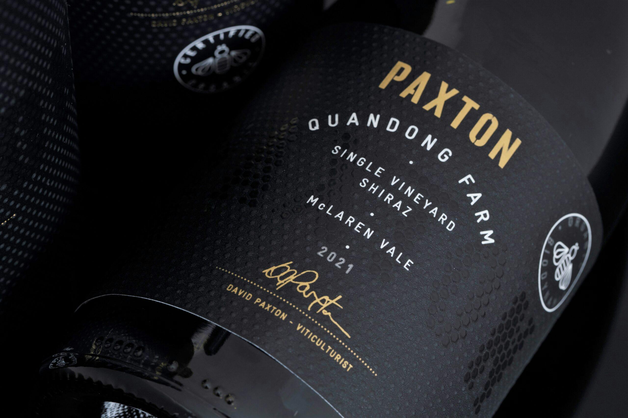
Quandong Farm, Jones Block & Cracker Barrels were developed by Paxton’s Sales and Marketing Manager Brian Lamb with designer David Byrlee. These three labels from Paxton’s premium single vineyard range use black and gold foil highlights to communicate their top-tier positioning.
Share
The label backgrounds incorporate the brand’s ideology using a subtle screen honeycomb pattern, paying homage to Paxton Wines’ icon, the bee, acknowledging its importance to biodynamic farming practices. High build varnish blends seamlessly with the pattern to lift the name PAXTON from the backgrounds, adding depth and tactility to the finished packaging.
Label Information
-
Producer – Paxton Wines
-
Designer – David Byerlee
-
Region – McLaren Vale, South Australia
-
Varietal – Shiraz & Shiraz Cabernet
-
Printing – Digital
-
Substrate – Verdure Harvest & Rafwine Bagasse
-
Embellishments – Gold Foil, High Build Screen and Spot Satin Varnish