Resources
Cases
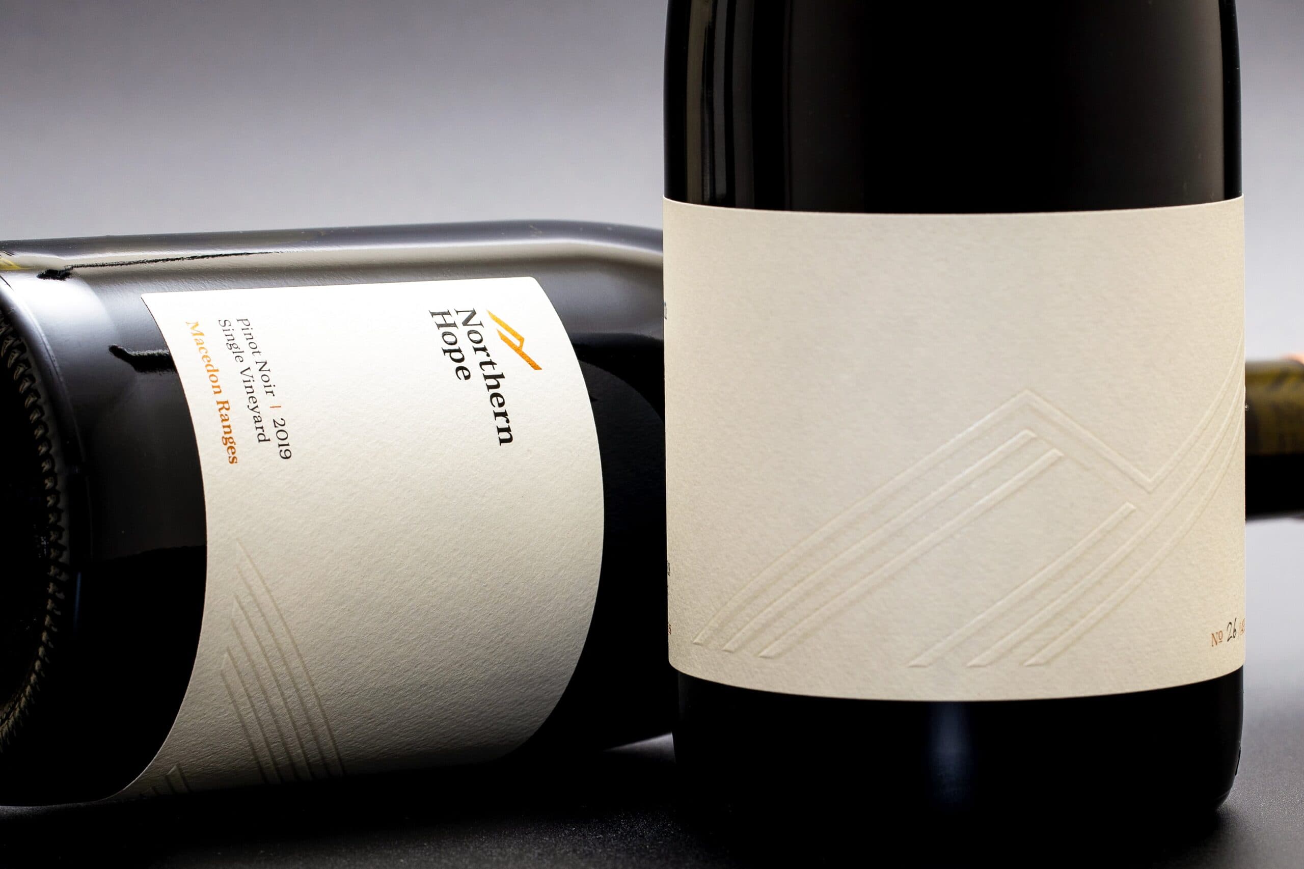
Northern Hope
Northern Hope Pinot Noir speaks of the beautiful and rich land of the Macedon Ranges.
Created by Samantha and Richard Edwards, two Northerners from England, our branding is inspired through the way we work with wine. We believe in letting the fruit and the land tell the story; our hands off, minimal intervention approach helped to evolve our design and branding ethos.
Share
Minimal. Clean. Luxury.
We wanted to have room for negative space, allowing the eye to focus on the featured elements. Instead of using a front and back label we chose to do a single wrap label, separating the logo, region and variety to the left edge and pushing everything else to the right, creating this huge blank canvas.
One of the biggest challenges of the design was to make sure that the minimalistic approach is not confused with blandness. Like our wine we wanted to encapsulate the depth and layers and bring this into our design.
To achieve this, we have applied textural design; we’ve added a colourless line drawing of the logo with embossed elements. Pearl foil is applied in sections of the logo to provide further dimension and help catch the light. These considered design features all help to create a subtle and sophisticated look, drawing in the customer’s attention and, more importantly, encouraging them to buy the wine!
Label Information
-
Producer – Northern Hope Winery
-
Designer – Richard Edwards
-
Varietal – Pinot Noir
-
Region – Macedon Ranges, VIC
-
Printing Press – Digital
-
Stock – Cotone Bianco
-
Embellishments – Pearl Foil, Copper Foil, Emboss, High-Build Screen