Cases
Specialty ink captures playful side of brand refresh
Wanting a creative refresh that conveyed the essence of the brand, MCC worked, researched, developed and trialed the use of thermographic inks to deliver a dynamic living label.
Share
This boutique Adelaide Hills wine company has a reputation for being slightly unconventional and perhaps even a little bit outrageous! In chess, El Desperado is a doomed pawn determined to sacrifice itself to bring about a stalemate when captured, setting out to do as much damage as possible. The creative brief for the El Desperado label refresh was unique and exciting, reflecting the winery’s philosophy about wine, chess and the infamous pawn.
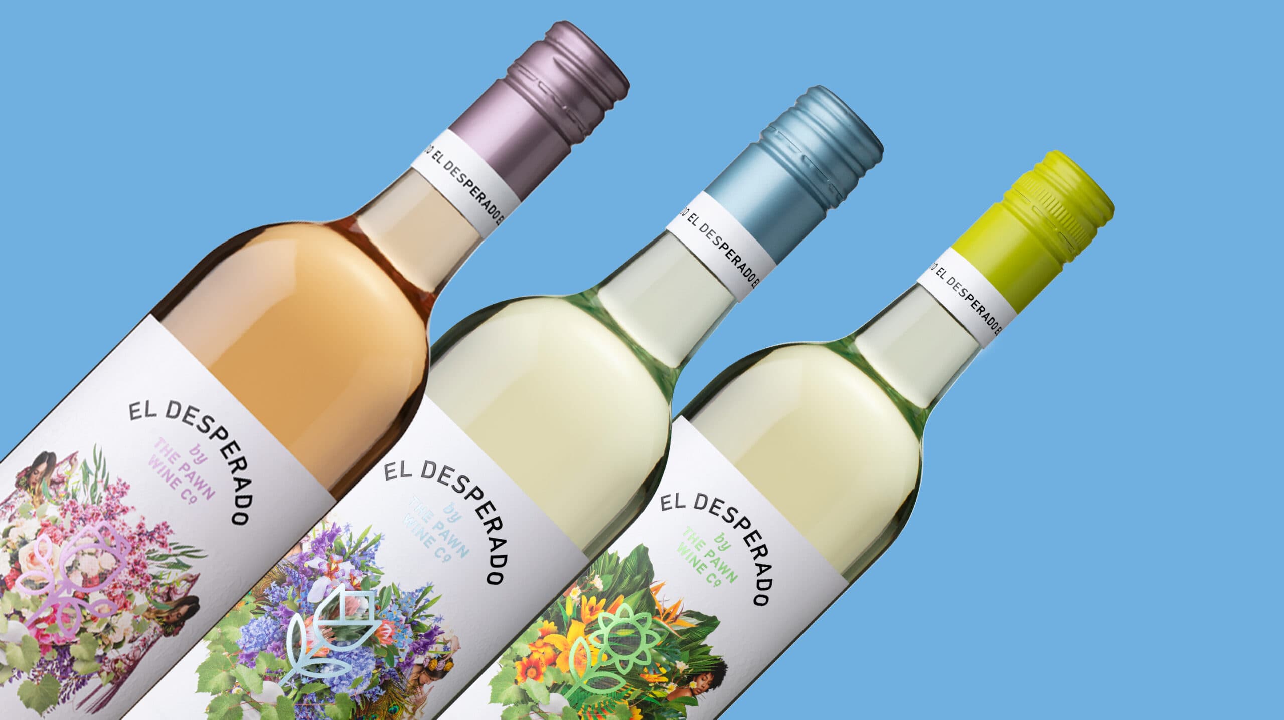
The clever design leverages the thermographic ink and changes with the temperature of the wine. For your drinking pleasure – when the flower on the label blooms, it indicates that this wine is chilled at its ideal drinking temperature to share and enjoy.
The El Desperado is an eye-catching label that gets everyone talking. Winemaker Tom Keelan and designer Chad Holman were thrilled with the results and will look at incorporating thermographic ink in future projects.
The Pawn Wine Co. wanted to reinvigorate the direction of the El Desperado packaging, and the team at MCC had the perfect solution. We moved away from the original lenticular design to the thermal label which ‘blooms’ to indicate the ideal drinking temperature. For a wine that doesn’t take itself too seriously, this packaging solution has an approachable, yet sophisticated edge which the everyday wine lover has embraced.”
Tom Keelan, Co-Founder & Winemaker, The Pawn Wine Co.