Trend Article
Why Label Design Matters
You only get one chance to impress with your brand. Your packaging and label is that chance – seize it. A graphic designer can be a central figure and give graphical form to who you are and what your brand stands for.
Share
Ensuring your brand’s story is well-executed and stands out on the shelf is what label design is all about. We spoke with two designers from different corners of the world to get their take on what makes a successful label project.
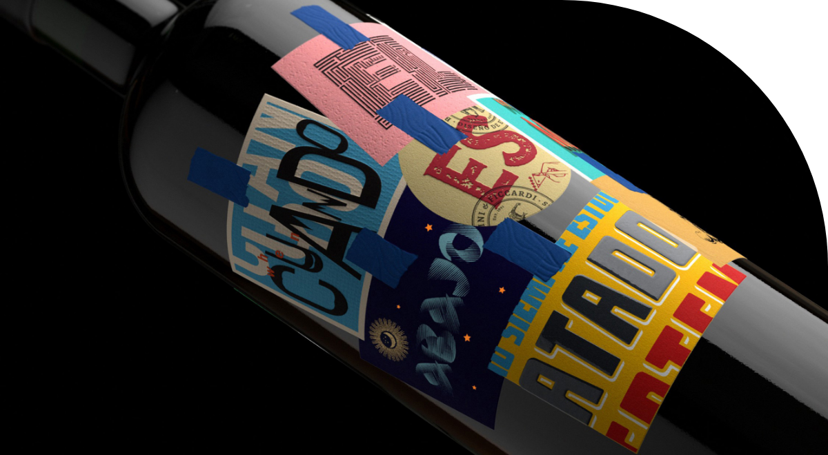
Boldrini & Ficcardi I Mendoza, Argentina
If Argentine Malbec had to choose a quality label designer, B&F would probably be the first choice. They founded their design studio 30 years ago in the heart of the Mendoza wine region. Since then, they have been instrumental in the growth of the Argentine wine landscape with innovative, elegant and sophisticated designs, influencing the next generation of wine and spirits designers around the world.
For this project, Victor Boldrini and Leonardo Ficcardi worked in collaboration with MCC Mendoza to develop a stunning label for the Make a Mark wine catalog, for the Delacasa label of Terroir Wine winery.
What was your inspiration for the design of this label?The inspiration for the creation of this packaging was born from the idea of transmitting a good message through a bottle of wine – an explicit need to say something different, good and positive, beyond the quality of the product and its origin. We wanted to explore the possibilities of wine communication, outside the usual limits of the wine industry, to do something experimental.
We searched our emotional memory, remembering when we were students in the 80’s, the parties at friends’ houses and the music (national rock) that accompanied us everywhere. They were very intense times due to the beginning of democracy in our country, and with our teenage vision we were beginning to become aware of design and its potential.
What was the process of creating the design of this label?We found a great message listening to a playlist of records from those years. One phrase from a Charlie García song caught us immediately – “cuando el mundo tira para abajo, es mejor no estar atado a nada”, which translates to “when the world is going down, it’s better not to be tied to anything”. This sparked an idea, and we had the courage to make many labels, and not “attach” ourselves to a single design. We went to cutting out parts of images from our everyday landscape and gluing them by hand one by one until the bottle is almost completely wrapped with street posters, calligraphy, vintage alphabets, and colors of a vibrant and restless palette. In that way, each small paper with its own style began to speak for itself, intertwining and dialoguing with the rest.
At what point in the design process do you start thinking about label printing?We started to think about the printing and production of elements from minute zero. It is our way of working, we have been doing it for many years and have learned that imagination and production should not be separated. As times change, technologies are advancing and it is easier and easier to get good results.
A good brand must establish a pleasant and fluid dialogue with its consumers, it must not disappoint them…if the brand is good, those moments are enhanced and remembered forever.
Victor Boldrini & Leonardo Ficcardi, Co-Owners, Boldrini & Ficcardi
Chad Michael Studio I Dallas, Texas, United States
Chad Michael Studio was founded in 2014 and quickly grew into an international, award-winning packaging design and branding studio dedicated to spirits and specialty goods. Drawing on their work for Warfield Distillery, Chad tells us how each design goes through an extensive, internal process to ensure that every aspect of the work is engaging, artisanal and most importantly – tells a story.
What inspired you with this label design? After initial exploratory discussions with the client, we framed the character of Warfield Distillery as the mountainous, supreme master of all that is feral. A brand that if dropped in the center of the wilderness would not only survive but thrive. The goal was to develop an iconic range of spirits that represented this character. The designs are masculine, laced with colors and textures that exude wilderness and inspired by the objects we use to explore the wilderness.
What was your design creation process for this label?All aspects of packaging were inspired by items, materials, and textures connected to the great outdoors. The labels feature a large “badge”, much like a park ranger would proudly wear. Tiny details throughout the foiling give nods to fishhooks and paddles. The lower strip is printed with a blind embossed, custom MCC pattern that is reminiscent of canvas. Every aspect, from the texture of the paper stock to which elements are selected for print embellishing, must have a conceptual purpose.
At which point in the design process do you start to think about the printing of the label? After discovering who the brand is and what they stand for, we dive into the strategy of how best to express their brand identity, vision and their story. If it’s a top shelf product with a high retail price, we explore materials and printing methods early in the design phase. This is because materials can play a crucial role in packaging design. The willingness to explore substrates and materials outside of a paper label is much higher. When working with a limited budget, as is often the case for most start-up distilleries, we start thinking about printing techniques while developing the label design.
The final design is a reflection of the studio so it must be sensational or we’ve failed. We feel we are only as good as our last design so we are constantly pushing on all fronts.
Chad Makerson Michael, Owner and designer at Chad Michael Studio