Cases
Label Texture, Glitter Ink, and Emboss Completes True Colour’s Redesign
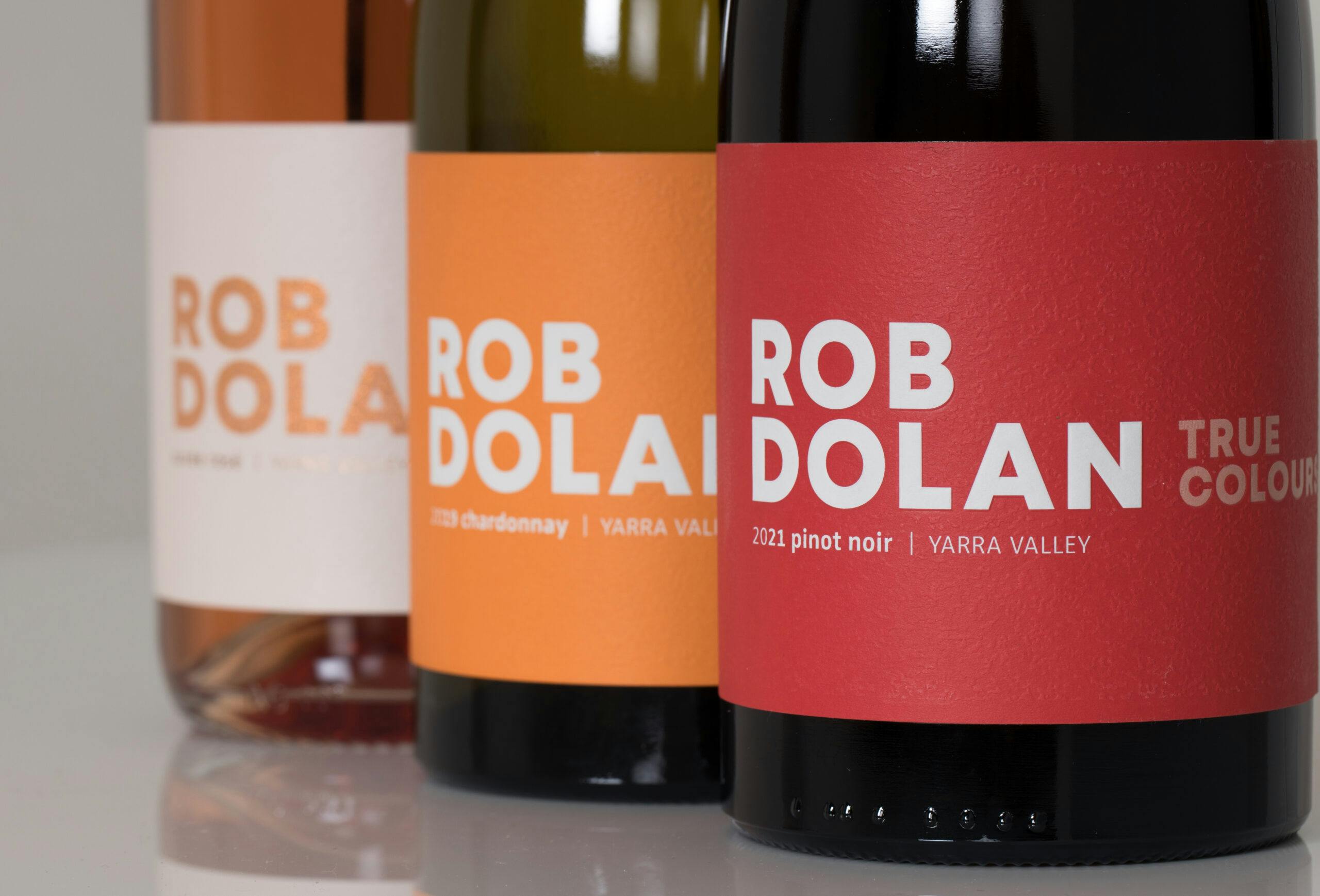
Same Wine, New look! Paired back and timeless was the brief for the True Colours re-design.
Share
The team at Rob Dolan, states that they always knew that to elevate the design, it was coming down to the printing quality and finishes chosen.
The Wren background gave the label a textural element along with the raised round embossing which added that extra feel to the touch. MCC created a custom colour for each design, which was paramount to stand out from the crowd and provide a playful element to each label.
The sparkling was a new product in an existing range and we wanted to add a little ‘bling’ with the MCC custom copper colour of the Meck Speckle that was paramount to make it stand out from the crowd and provides an elegant design feature to the label.
Label Information
-
Producer – Rob Dolan Wines
-
Designer – Patti Mikedis LUSH CREATIVE
-
Region – Yarra Valley
-
Varietal – Cuvee Rosé & Pinot Noir
-
Printing – Digital
-
Substrate – Tintoretto Gesso Ultra
-
Embellishments –
-
Cuvee Rosé – Meck Speckle High build with Wren Texture
-
Pinot Noir – Wren Texture emboss, raised round emboss
-