Cases
Sustainable Rosolio From the Garden to your Table
Roses provide more than just a beautiful arrangement for your table. Dating back to the 1400s, Rosolio was a type of Italian liquor, which later expanded to different parts of Europe and enjoyed as an aperitif. The term, Rosolio, was used when referring to botanical and aromatic liqueurs, and were often found with additives such as citrus, cinnamon, and saffron.
Share
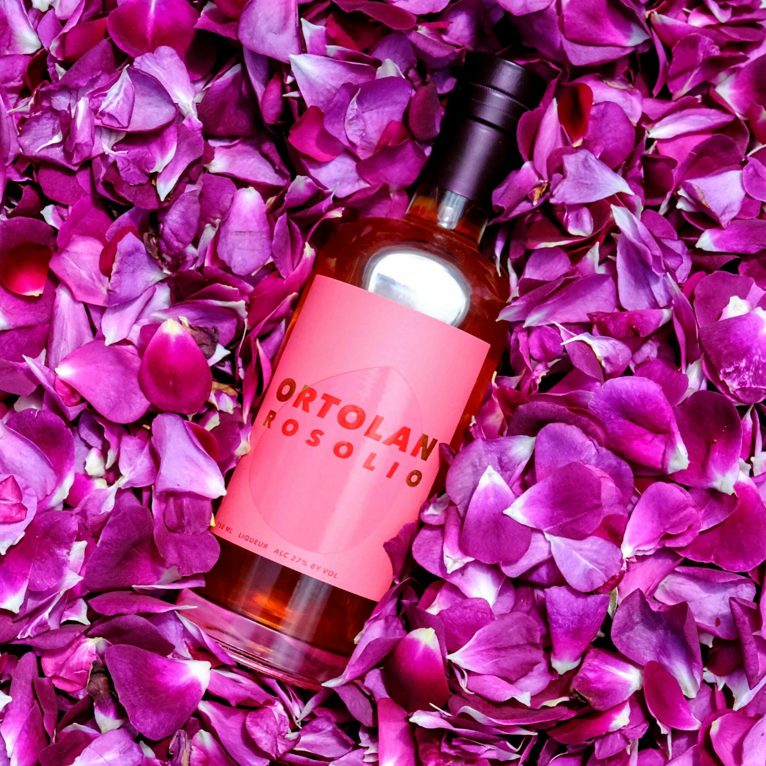
Ortolan Rosolio is a modern take on the traditional liqueur, made up of 30 different types of heirloom garden roses, sustainably farmed and picked by hand in California. The goal was to create a versatile product that can complement various kinds of cocktails, while still maintaining the refreshing flavors that the rose petal releases. Because of this special story, they needed a captivating label.
The team at Ortolan Rosolio worked with designer, Michael McDermott, and were going for a modern, Californian take on retro-Italian vibes, like the product itself. They also wanted something that would catch someone’s eye amongst a sea of more traditional labels and colors.
The team at Ortolan Rosolio came to MCC because of their desire for a modern and eye-catching label. This label is surely one-of-a-kind due to its pop of color, contrast of gold foil, and the screen gloss shine of a rose petal shape to tie the whole story together. Bright fluorescent ink was used to help dazzle the crowd, resulting in the label glowing in the dark.
One unique element to the rosolio that makes a bartender (and the customer) fall in love – it changes color! The warm amber color in the bottle changes to a bright pink when in contact with acidity, which in turn complements the beautiful label.
In addition, the bottle would potentially be exposed to cold temperatures and moisture, so the team decided that Killer WhiteTM would be the best stock to maintain its quality and true pink color.
We like how the MCC team made the color-changing property reflect in the label–under blacklight the Killer White goes blue, while the neon ink of the “petal” pops in pink! MCC took Michael’s work and not only nailed it on the colors, but took the overall design and concept up a notch with the blacklight and Killer White. After press-check, our sales rep Mark Schmick, took us into his office and told us he had something to show us, then turned off the lights and shined a blacklight on the bottle. We were wowed. Our experience working with MCC has been amazing at every level, and we couldn’t be happier with the results. Despite the seeming simplicity of the design, getting the colors just right and making it pop how we wanted took a lot of work, and we thank the whole team for such an amazing result!
Robert Collier, President, Purveyor, Co-Founder at Appanage Brands