Compartilhar
Imprimação
What’s in a label? Lots… Helmsfolk spent a long time on their labels. Like their gin they wanted to get it just right.
Helmsfolk honours the Spirit of Exploration, sharing a love of Norfolk Island’s people, history and culture that is born from centuries of seafaring adventurers, explorers, convicts and mutineer descendants that journeyed across the oceans to make the island their home. The Norfolk Gin is distilled with botanicals to link Norfolk Island and the story of the sloop Norfolk, built on Norfolk Island in 1798, and used to circumnavigate Tasmania and discover that it was in fact, an island.
The label design for The Norfolk Gin started with a bottle to put it on. As their first gin, they chose a classic bottle, challenging themselves to use the label design to create a point of difference. So, they spent a great deal of time thinking about texture and shape and what effect it has on the way consumers interact with the bottle, and what it says about the product and the brand story.
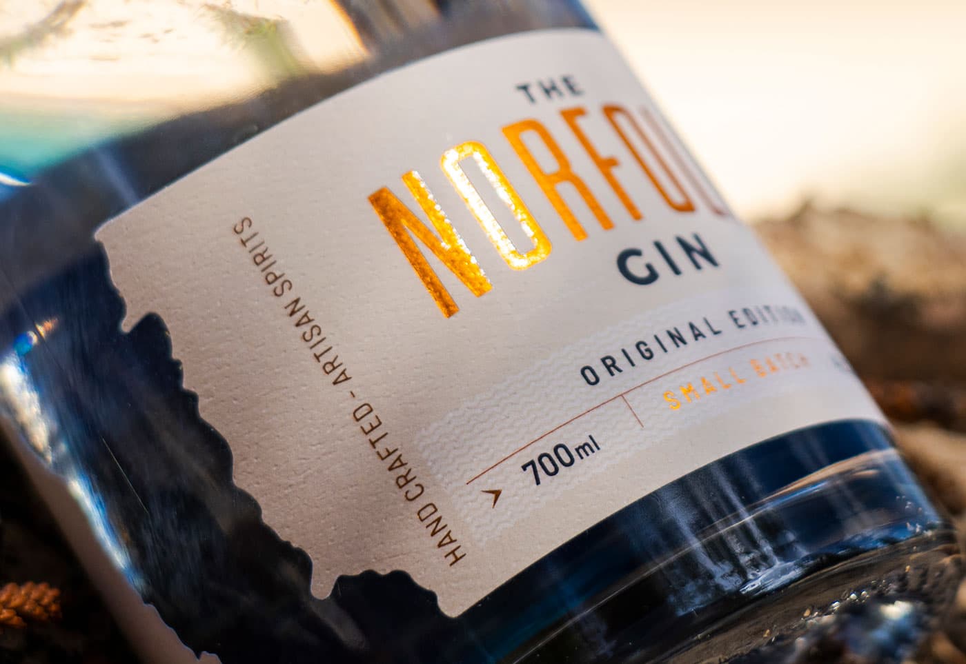
They chose an uncoated paper label stock that had a textured feel to emulate the feel of old maps and charts – connecting the bottle, the story and the gin. Further texture has been added using a raised glossy high build screen on the foiled word Norfolk and the Helmsfolk brand seal.
The shape of the label speaks volumes about what you can expect to find at Helmsfolk. Unwrapped from the bottle the label is actually a rolling perpetual wave that flows around its circumference. The reason for this is partly to break the linear edges of bottle sides but also to encourage the consumer to rotate the bottle itself to discover the whole label.

If you look to the left and right of the label you will see two very distinct shapes which have been die cut from the label. They are the eastern coastlines of both Tasmania and Norfolk Island. Through this window you can see inside the bottle, where the double-sided label reveals the names of the recorded destinations and landmarks sighted or named in Norfolk by all those that sailed in her. This ‘message in a bottle’ further engages the consumer with the brand story and the bottle itself.

Finally, the neck labels feature the overarching Helmsfolk brand in copper foil – watching over the bottle.
Label details:
- Producer – Helmsfolk
- Designer – Insprint
- Photographer – Robin Nisbet
- Printing – Digital
- Substrate – Bright White Felt
- Embellishments – Foil, High Build Screen

