Cases
All Hands on Deck for Archipel Spiced Rum
During the Prohibition era, sailors, pirates, and smugglers left the West Indies for Bermuda, leaving some to drift off to St-Pierre-et-Miquelon, a southern island of Canada. They arrived at an archipelago, a group of small islands, in the middle of the St Lawrence River. This turned out to be the route in which many ships sailed – carrying on board cargos of rum, destined for the various illegal markets in America.
Share
Legend has it, in Québec, the rum filled barrels, were transported to one tiny island which the smugglers called in their own language “The Spicy Island”. The rich history of our ancestors, in conjunction with the southern traditions and the boreal flavors, inspired the story behind Archipel Spiced Rum.
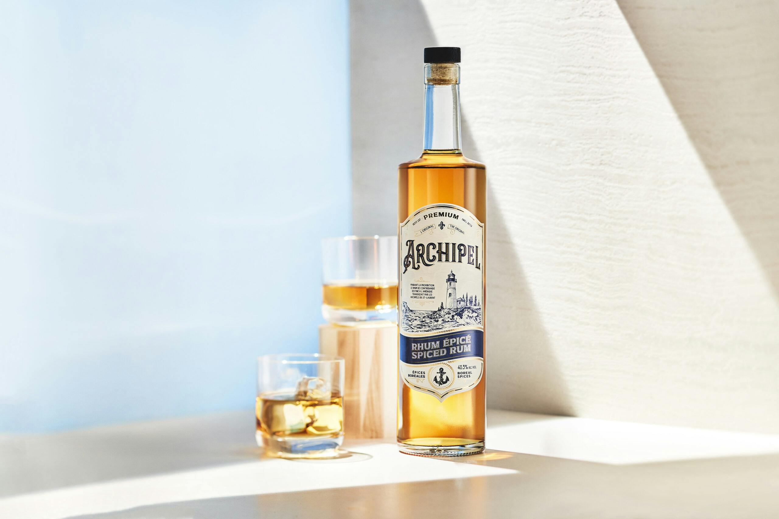
The team at Archipel Spiced Rum and designers from Ezi Brand Design were motivated to create a label that gives a nod to the history but in a polished and tasteful way. With MCC’s printing technologies, the team was able to achieve the elegance they were looking for. This label exudes old world energy through the thin gold foil lines and rope details and traditional nautical colors of blue and white. This label is printed on Killer WhiteTM, allowing for the colors to pop, but shielding it from distortion from wet or cold environments. Tango Photographie well captures the unique shape of this label as the lines draw the consumer’s eye from the top of the bottle down to the bottom point.
With the help of their colorist, MCC was able to offer us color shades outside the choices available. In order to adequately reproduce the bottom of the label, the prepress department provided an innovative overprinting solution and obtained an exceptional color density. This solution helped achieve our marketing objective for Archipel Spiced Rum!
– Olivier Lord, Digital Designer, Technical Director, & Print Production Manager, Ezi Brand Design